When building a SaaS company its easy to overwhelm yourself with Google Data Studio charts, Mixpanel usage metrics, or Google Analytics conversion metrics.
When I analyze a SaaS company before I interview them for my podcast The Top Entrepreneurs, I always try and plot where they are in terms of these 6 charts. I think CEO’s will find these useful as well as quick indicators of company health:
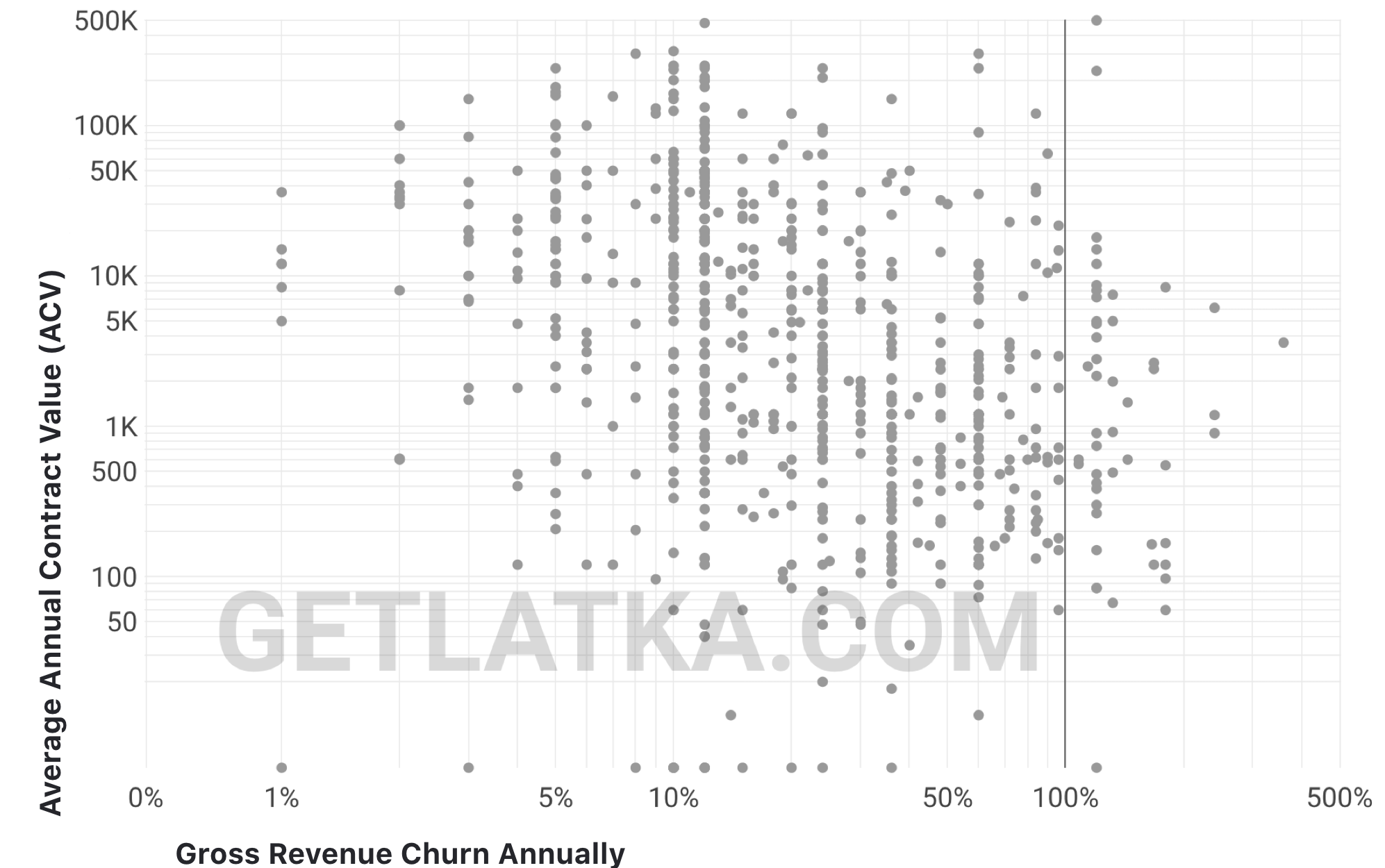
1. Is your churn high or low relative to your price point?
Chart: Annual contract values on left side, gross revenue churn annually across bottom
Most founders give up on trying to improve churn saying something like: “It’s just because our customers are small and they go out of business!”
Use the chart below to see if your churn is in range of others serving those same sized customers, measured by how much they pay you.
2. Do you have a shot at $100m ARR at current price points?
Chart: ACV vs Customer Count
Price point won’t kill you but it can drastically increase your shot at building a $100m revenue (ARR) company.
It’s a helpful exercise on Day 1 to ask yourself: “Can I get enough customers are our initial price point to build to $100m in revenue?”
Those companies in dotted square below are stuck. They either need to increase price drastically or decrease price and 100x the shear number of customers they serve.
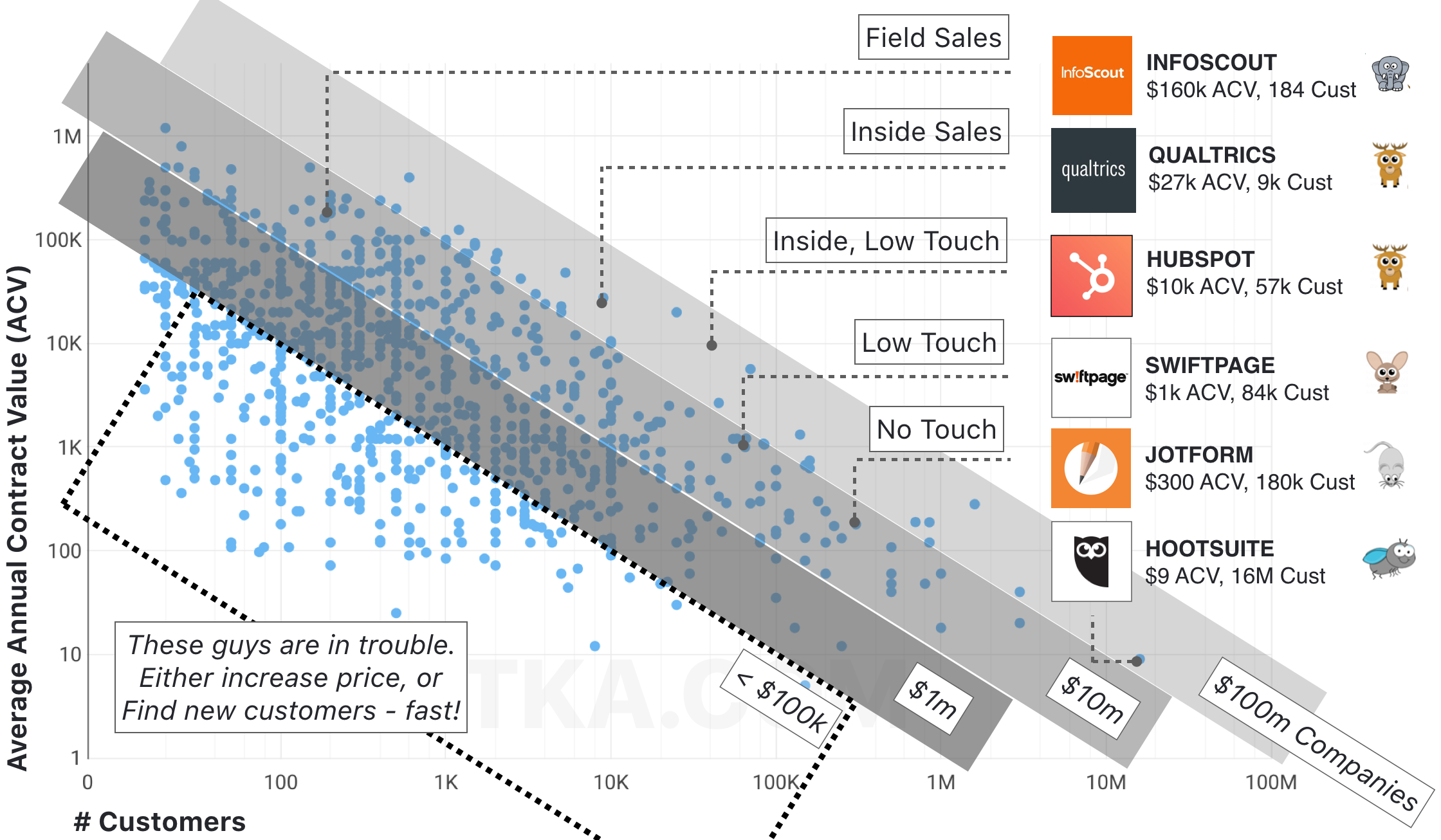
Fig 1.2
3. How to raised next round of funding, if growth behind targets
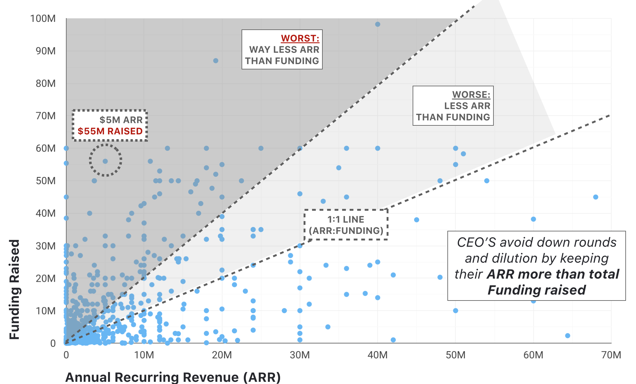
Chart: Funding raised vs ARR
It is possible to overfund your company, despite how tempting that next TechCrunch headline is. Most companies raise capital ahead of revenue growth so you’ll constantly be trying to get revenue up to drive a higher valuation on your next round, avoiding a down round and serious dilution.
To always maintain leverage as a founder, I recommend never raising more than 3x your current ARR after you’re past $1m in ARR (obviously rule doesn’t work smaller than this – totally find for companies to raise $200k seed pre-revenue to build MVP).
Strongest companies in this chart are in the bottom right.
4. Are you spending too much or too little to acquire customers?
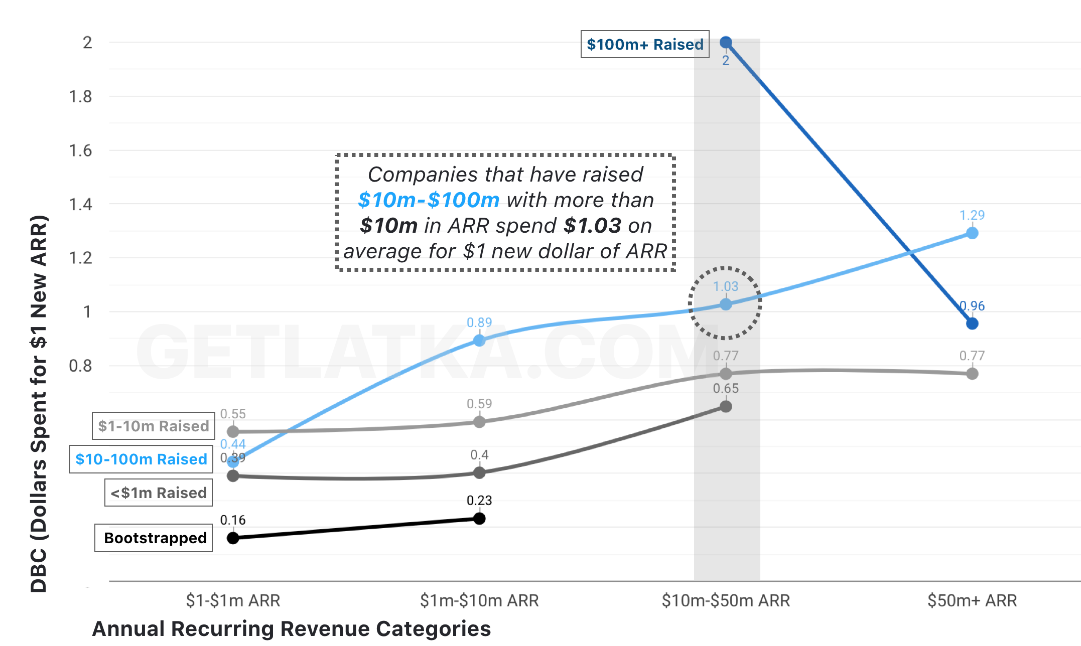
Chart: CAC vs. ARR/Funding buckets
Averages are dangerous here but they still provide good guidance. Trend here is what you’d expect, companies with more raised (dark blue line) spend more to get customers than their bootstrapped competitors.
5. How much ARR should you make from each of your employees based of roles?
Chart: ARR vs Team Size
Things like outsourced dev teams, location reliant salaries, and nature of competitive hiring markets drastically effect the targets below, but generally speaking, if you’re making more than $150k – thats revenue/ARR – per employee, you’re more profitable than your competitors.

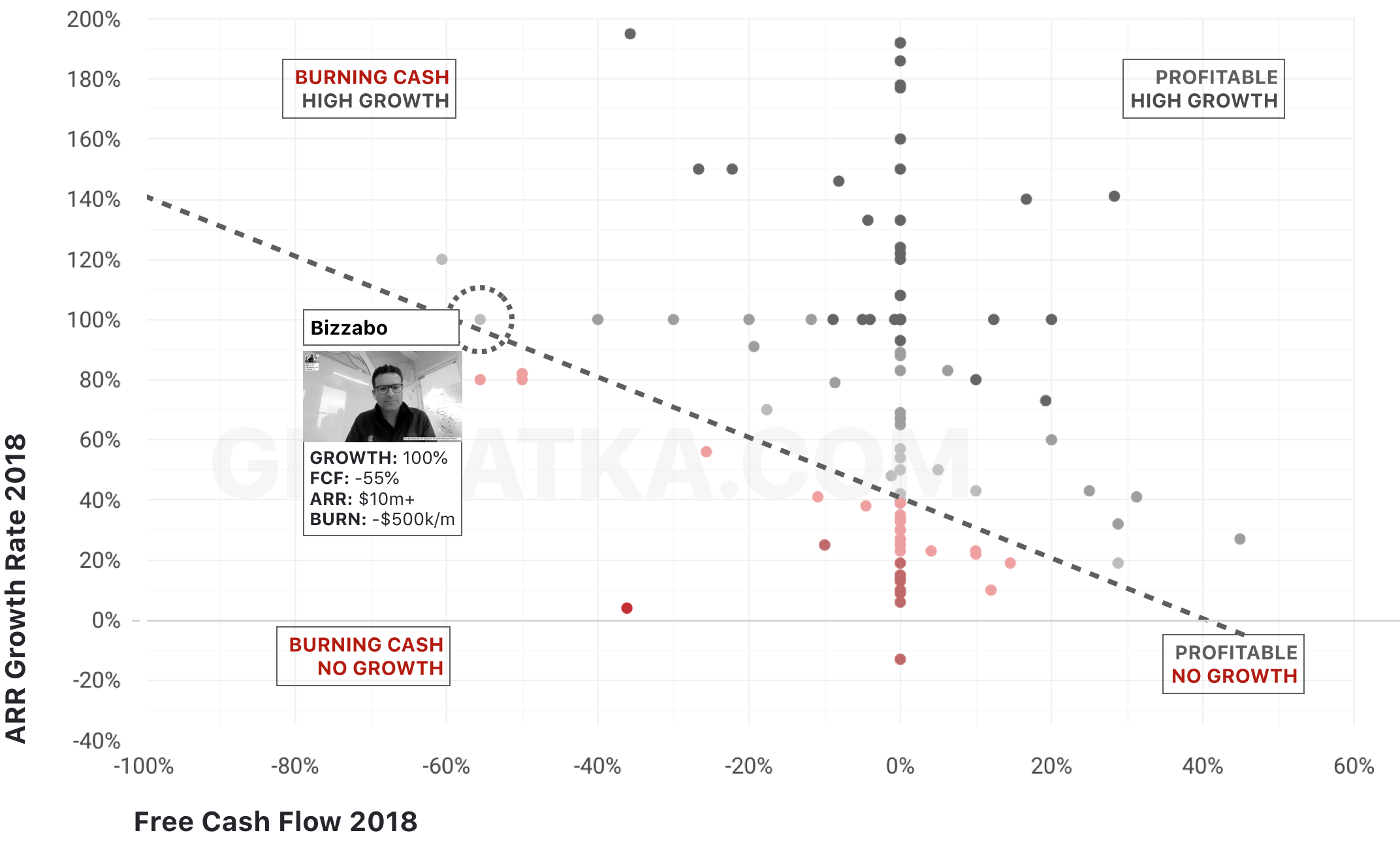
6. How much money should you be burning at $1m ARR, $10m, $50m, and $100m
Chart: Free Cash Flow vs. ARR Growth Rate
This is called an E40 metric. The majority of enterprise value in public SaaS market is owned by SaaS companies where E40 is greater than 40.
This means 2018 free cash flow % + 2019 ARR growth rate % is greater than 40.
Where do you fall on the graph below?
These charts are by no means exhaustive but they provide quick guide points that should directly tie to strategic decisions: Spend more on CAC, slow down hiring, drive more growth relative to your burn rate.


